In this age of point-and-click digital design, choosing and using royalty free fonts can seem as almost as complicated as the good old days of printing presses and metal typesetting. There are so many categories to choose from that you may find yourself in a whirlwind of strokes. To help you find the best web fonts, here are the four basic types that can be useful to understand when choosing a suitable font, combining great fonts for your graphic design and commercial projects, and discussing your choice with people.
- SERIF
Serif fonts have a decorative line or taper added to the beginning or end of a letter’s stem. They have been widely used in books, magazines, and newspapers. Companies also use them to be seen as trustworthy, reliable and established. Some of the most common examples of serif fonts include Times New Roman, Georgia, and Courier New. They lend a traditional feel to business cards, logo design, and marketing brochures. - SANS SERIF
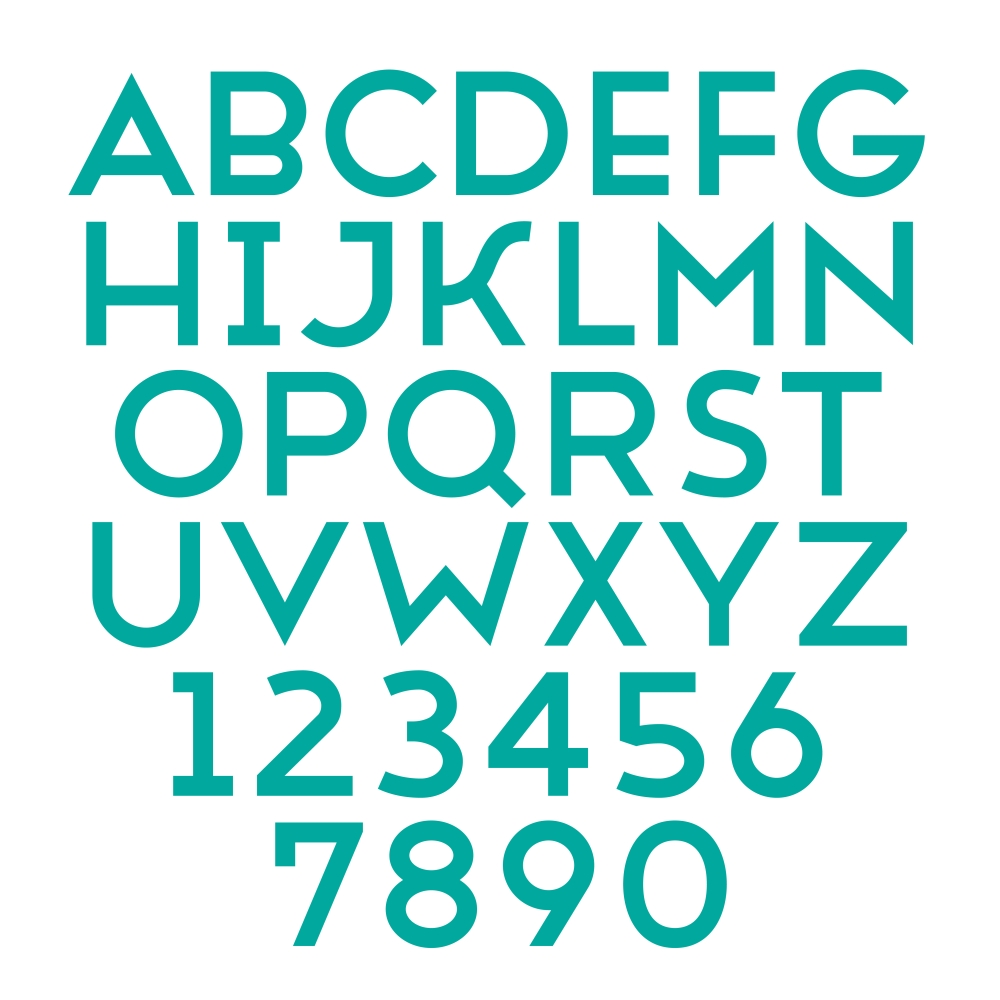
Sans Serif fonts look more modern and streamlined due to the lack of extra lines on starts and ends of letters. They come across as more youthful and accessible, which make them the go-to choice of startups or tech companies. They can also be used on creative branding designs, such as logo design and social graphics. The most popular Sans Serif fonts include Helvetica, Arial, and Calibri. - SCRIPT
Scripts, commonly referred to as cursive or handwriting-style fonts, generally have connecting letters. They resemble handwritten and calligraphy lettering styles, so they can appear both formal and playful. They are mainly used in wedding invitations, headings for announcements, or advertising. They also come in different styles, from fun and casual, to elegant, to hand-drawn. Some of the best examples are Alex Brush, Pacifico, and Great Vibes. - DECORATIVE
Decorative fonts get your attention with their fancy look. They are more unusual than practical, so you should only use them in small doses for a specific effect or purpose. Some of the great fonts include Centeria Script, Atlantika, and Authentica. A designer, writer, or artist generally use them for titles and headlines, and for small amounts of text in large sizes, such as postcards and greetings cards.
For a designer, choosing web fonts is comparable to choosing an outfit to wear. Your clothes say a lot of things about you. They also have an element of appropriateness, meaning you can’t wear a bathing suit to a job interview. Font choices serve the same purpose in design. They provide an at-a-glance first impression, so your decision needs to be purposeful and appropriate. Font guide here.
Is your font choice suitable?
Choosing a font style that suits where you are intending to use is crucial to the success of your project. For book text, magazine, and newspaper, use web fonts that are easy on the eyes and easy to read. They should not be too distracting, so your readers can quickly scan or skim your content. For headlines and titles, download decorative fonts. They capture attention and make a huge impact when used correctly.
Where to find royalty free fonts
While there are a plethora of free web fonts on the market, it is still best to download fonts from reputable stock art agencies such as Stock Photo Secrets. SPS offers retro to modern fonts under royalty free license, so you can use them without legal liabilities. Their collection contains over 1,500 web fonts, giving you plenty of choices to complete your commercial projects and graphic design.